Interior Design Hacks To Create A Luxe Finish
You walk into a friend’s apartment. It feels expensive. Calm. Put together. But you know they didn’t drop $20k on a gut reno. What did they do?
They used hacks. Not the “paint your fridge gold” kind. The smart kind that change how your brain reads a room. Here are the seven that actually work.
1. Paint Is the Cheapest Lie You Can Tell — Use It Right
Paint is the single highest-ROI move in interior design. A $50 can of paint can make a room look like it cost $5,000 more. But most people screw it up by picking the wrong sheen or the wrong color.
Go Matte on Walls, Semi-Gloss on Trim
Matte paint hides imperfections. It absorbs light instead of reflecting it, which makes walls look smooth and expensive. Flat or matte finish on walls is standard in luxury homes. Benjamin Moore’s Regal Select in matte ($55/gallon) is a solid choice. It covers well and scrubs clean better than most mattes.
Trim, doors, and baseboards should be semi-gloss or high-gloss. The contrast in sheen creates depth. Your eye registers the difference as “craftsmanship.” Use Sherwin-Williams ProClassic in semi-gloss ($48/gallon).
Color Drenching: One Color, Every Surface
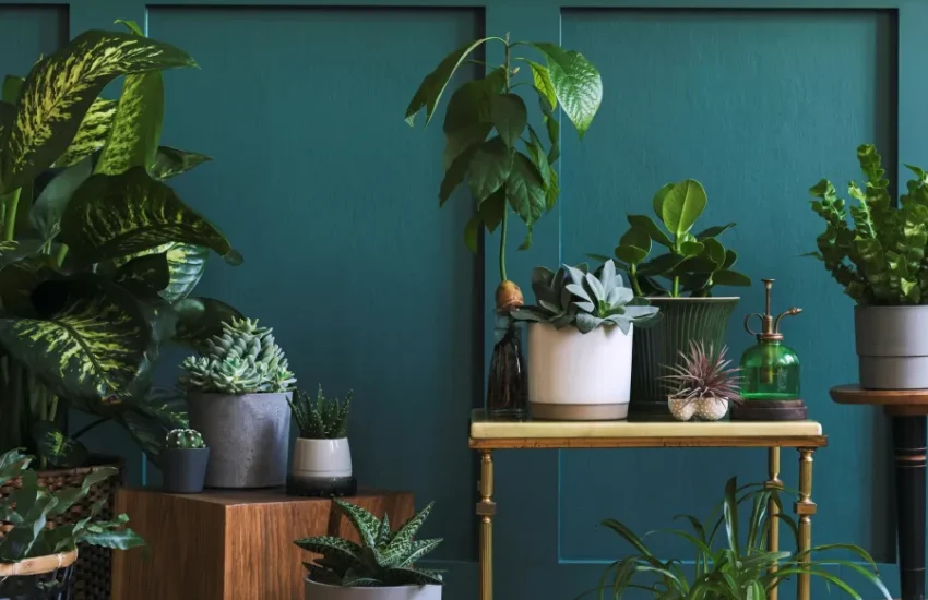
This is the hack that separates amateurs from people who get complimented on their home. Pick one color. Paint the walls, the ceiling, the trim, and the doors all the same color in the same sheen. It blurs the edges of the room. The ceiling disappears upward. The room feels bigger, taller, and intentional.
Farrow & Ball’s ‘Hague Blue’ ($110/gallon) is the go-to for this. Yes, it’s expensive. But you only need one gallon for a small room. The effect is worth it.
What Not to Do
Don’t use eggshell on walls. It’s neither matte nor glossy — it just looks like cheap builder-grade paint. Don’t paint just one accent wall unless you’re in 2014. Don’t skip priming over dark colors.
2. Lighting: The One Thing Rich People Never Cheap Out On
Luxury is not about what you see. It’s about what you feel. And nothing controls feeling like light. Bad lighting makes a $10,000 sofa look cheap. Good lighting makes a $200 IKEA sofa look intentional.
Three Light Sources Minimum Per Room
Overhead lights are for cleaning, not living. Every room needs at least three light sources at different heights: a ceiling fixture, a floor lamp, and a table lamp. The IKEA ‘Forsa’ work lamp ($25) pointed at the wall creates indirect light that feels soft and expensive. The CB2 ‘Stilt’ floor lamp ($349) adds a sculptural element and casts light upward.
Dimmers Are Non-Negotiable
A $15 dimmer switch from Lutron transforms a room more than any furniture purchase. Install one on every overhead light. You want the ability to drop light levels to 20%. That’s where the room becomes a mood. Lutron Caseta wireless dimmer ($60) works with smart home systems and takes five minutes to install.
Warm Bulbs Only
2700K to 3000K color temperature. Anything above 3500K looks like a hospital. Philips Hue White Ambiance bulbs ($15 each) let you adjust warmth from your phone. Set them to 2400K in the evening.
One more thing: never use a bare bulb. It’s harsh. Put a shade on it. Even a $5 paper shade from Muji diffuses light into something soft.
3. The 80/20 Rule of Texture
Here’s a truth most people miss: a room full of flat surfaces looks cheap. A room with varied textures reads as layered, curated, and expensive. Texture is the cheapest way to add depth.
The Ratio
Aim for 80% smooth/neutral textures and 20% rough/heavy textures. The rough stuff provides contrast. Without it, the room feels sterile. With too much, it feels chaotic.
| Surface Type | Smooth (80%) | Rough/Textured (20%) |
|---|---|---|
| Walls | Matte paint, smooth plaster | Linen wall hanging, woven tapestry |
| Floor | Wide-plank wood, polished concrete | Shag rug, jute runner |
| Furniture | Leather, velvet, smooth wood | Chunky knit throw, nubby wool pillow |
| Accessories | Ceramic, glass, polished metal | Raw wood bowl, stone sculpture |
Cheapest Texture Hacks
A $30 chunky knit throw from West Elm draped over a plain sofa changes the entire feel of the room. A $15 jute rug from IKEA under a coffee table adds warmth. A single ceramic vase with a matte glaze costs $12 at Target and breaks up a glass coffee table top.
Don’t buy fake plants for texture. Real plants have leaf texture that can’t be replicated. A Monstera deliciosa ($20 at a nursery) in a plain terracotta pot adds organic texture that screams “I have my life together.”
4. The One Furniture Rule You’re Probably Breaking
Most people buy furniture that’s too small. They push everything against the wall. The room ends up looking like a waiting room.
Float Your Furniture
Pull your sofa 6-8 inches away from the wall. Put a console table behind it. This creates depth and makes the room feel larger, not smaller. The gap behind the sofa is a place to put a lamp or a plant, which adds another layer of light and texture.
Scale Up
Buy the largest rug you can afford. A rug that’s too small makes the room look chopped up. The front legs of your sofa should sit on the rug. The rug should extend at least 18 inches past the sofa on each side. Ruggable’s 8×10 washable rugs ($299) are a practical choice for high-traffic rooms. They look like wool but roll into the washing machine.
What to Avoid
Don’t buy a sofa that’s too deep for the room. Measure the room first. A 96-inch sofa in a 12-foot room eats all the floor space. Don’t buy a coffee table that’s too high. It should be within 1-2 inches of your sofa seat height. Don’t match your furniture sets. A matching sofa, loveseat, and chair looks like a showroom. Mix pieces from different eras.
5. The Art of Negative Space
Luxury rooms breathe. They don’t cram every surface with stuff. The most expensive-looking homes have empty space. Empty shelves. Bare walls. Clear countertops.
The 50% Rule
Fill no more than 50% of your shelving. The rest stays empty. Group items in odd numbers — three, not two. Leave gaps between groups. This is called “visual breathing room.” A shelf with three objects and two inches of space between them looks curated. A shelf with twelve objects looks cluttered.
Countertops Are Not Storage
Kitchen counters should have exactly three things on them: a coffee machine, a knife block, and a fruit bowl. Everything else goes in cabinets. Same for bathroom counters. Clear the vanity. Put your toothbrush in a drawer. A clear counter reads as “clean” and “expensive.”
Bookshelves: The Test
If you can’t see the back of the shelf, you have too many books. Remove 30% of your books. Stack some horizontally. Add a small object — a ceramic vase, a framed photo — between stacks. The empty space is what makes it look intentional.
This is hard for most people. You’ve collected things. You like your things. But the difference between a home that feels “lived in” and one that feels “cluttered” is the empty space. Trust the empty space.
6. Hardware: The $50 Upgrade That Changes Everything
Kitchen and bathroom cabinets come with builder-grade hardware. It’s cheap. It’s shiny. It makes your whole kitchen look like a rental. Replacing it costs $50 and takes an afternoon.
What to Buy
Brushed brass or matte black. Satin nickel if you’re going for a cooler look. Avoid polished chrome — it shows fingerprints and looks dated. Schoolhouse Electric’s ‘Bishop’ knob ($8 each) in unlacquered brass will patina over time and look like it’s been there for a century. Emtek’s ‘Metropolitan’ pull ($15 each) in matte black is modern and substantial.
Measure Twice, Drill Once
Standard cabinet pulls are spaced 3 inches or 96mm between screw holes. Measure your existing holes before ordering. If you’re drilling new holes, use a template. A misaligned handle looks worse than the old one.
Door Handles Too
Interior door handles are often overlooked. Replacing them with something heavier — Schlage’s ‘Encore’ lever ($45 each) in satin nickel — changes how the door feels when you open it. Weight = perceived quality.
7. Curtains: Go High and Wide
The single most common mistake in interior design is hanging curtains too low and too narrow. It makes ceilings look lower and windows look smaller.
The Rule
Mount the curtain rod as close to the ceiling as possible — at least 4 inches below the ceiling, but no lower than 6 inches above the window frame. The curtains should extend 6-8 inches past the window on each side. When they’re open, the fabric should barely cover the window frame. You want to see the full window.
Length
Curtains should kiss the floor. Not hover an inch above it. Not puddle on it. Just touch. If you can’t find ready-made curtains in the exact length, buy longer and hem them. The Inside’s ‘Linen’ curtains ($89 per panel) come in 96-inch and 108-inch lengths. They’re 100% linen and hang beautifully. The weight of the fabric is what gives them that expensive drape.
What Not to Do
Don’t use grommet curtains. They look cheap and the rod shows. Use pinch-pleat or rod-pocket curtains. Don’t use blackout lining unless you need it for sleep — it makes curtains look stiff. Don’t use vertical blinds. Ever. Remove them and hang curtains.
That’s it. Seven hacks. None of them require a contractor. None of them cost more than a few hundred dollars. The difference between a room that looks expensive and one that doesn’t is rarely about how much you spent. It’s about how you spent it.